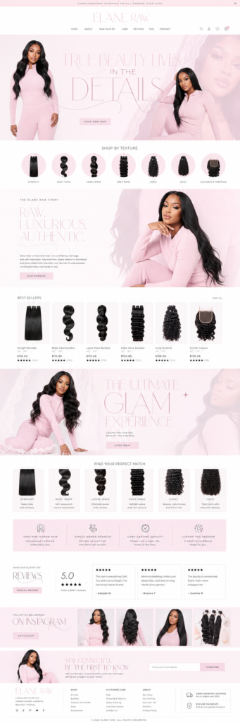
Your homepage gets more visitors than any other page — and most decide in a few seconds whether to stay. You don’t need a clever, complicated design. You need a clear order of sections that answers visitors’ questions one by one. Here is a simple homepage layout that works for salons, beauty brands, boutiques and service businesses.
In this guide
- Hero: what, for whom, what next
- Trust strip
- Your main offers
- Proof: work and reviews
- About you
- How it works
- Final call to action and footer
- Mistakes to avoid
- How the layout changes by business type
- How to test your homepage
- Homepage checklist
- Design for the phone first
- FAQ
1. Hero: what, for whom, what next
The first screen should answer three questions: What do you offer? Who is it for? What should I do now? Use one strong photo, a headline under ten words, one supporting line and one main button — “Book now”, “Shop best sellers” or “Get a quote”. A second, quieter button is fine (“See prices”). Skip sliders: visitors rarely see anything after the first slide.
2. Trust strip
Right under the hero, a slim row of three or four short points removes doubts: “Free shipping over $75 · 30-day returns · Pay later with Klarna” for a store, or “Licensed · 10+ years · 500+ happy clients” for a service. Small icons help people scan it quickly.
3. Your main offers
Show what people can buy or book, with photos: collection tiles for a store (best sellers, new arrivals, categories), or service cards with “from” prices for a salon. Limit it to the four to six most important — the rest belongs in the menu.
4. Proof: work and reviews
This is where visitors decide to trust you. Combine a gallery or best-sellers grid with three short reviews — first name, a sentence or two, stars. Customer photos and before-and-afters are the strongest proof you can show.
5. About you
A short section with your photo and two or three sentences: who you are, why you started, what makes you different. Small businesses win on personality — don’t hide it. Link to a fuller About page.
6. How it works
For services or custom orders, three or four numbered steps take the fear out of the first purchase: “Choose a service → Book a time → Pay a deposit → Enjoy”. Clear steps reduce questions and abandoned bookings.
7. Final call to action and footer
End with a full-width block repeating the main action — “Ready for your best hair? Book now” — and an email signup. The footer should hold contacts, hours, social links, policies and quick links. Many visitors scroll straight to the footer for this, so keep it tidy.
Mistakes to avoid
- Too many buttons on the first screen — choose one main action.
- Vague headlines like “Welcome to my website”.
- Pop-ups the moment the page loads — wait until the visitor scrolls or shows interest.
- Heavy images that slow mobile loading.
- Forgetting mobile — check every section on a phone first.
How the layout changes by business type
Service business (salon, lash, nails, braids)
Hero with a Book now button → trust strip → services with “from” prices → gallery → reviews → about you → how to book → final call to action. Booking is the main action; everything leads to it.
Product store (hair, cosmetics, clothing)
Hero with Shop now → trust strip (shipping, returns, pay later) → collections → best sellers → brand story → reviews and customer photos → email signup. Products are the main action.
Coach, consultant or creative studio
Hero with Book a call → logos or results → offers or packages → about → testimonials → how it works → FAQ → call to action. Trust and clarity matter most.
How to test your homepage
Before and after launch, run three quick tests:
- The 5-second test. Show the first screen to a friend for five seconds, then ask: what does this business do and what should you click? If they can’t answer, simplify the hero.
- The phone test. Open the homepage on your phone with mobile data. It should load quickly and the main button should be visible without scrolling.
- The click test. After a month, look at which buttons and sections people actually use. Move the popular ones higher and remove what nobody touches.
Write like you talk
The best homepage text sounds like you explaining your business to a new client in person. Short sentences, specific words (“silk press in Midtown Atlanta” instead of “premium hair services”), and no filler. Specific words convert better and help Google understand who you serve.
Update it regularly
Your homepage isn’t a one-time project. Swap the hero photo each season, refresh best sellers or featured services, and add new reviews. A homepage that changes a little every month looks alive to visitors and to search engines.
Homepage checklist
- Clear headline that says what you do and for whom.
- One main button on the first screen.
- Trust strip under the hero.
- Main offers with photos and prices.
- Proof: work, best sellers and reviews.
- Short about section with your photo.
- How it works in three or four steps.
- Final call to action, email signup and a tidy footer.
Design for the phone first
Most visitors will see your homepage on a phone, often with one hand while scrolling Instagram. Check that the headline fits on the first screen, buttons are big enough to tap, text is readable without zooming, and the most important sections come early. Long rows of products should scroll sideways or stack neatly in two columns. If the homepage works beautifully on a phone, it almost always works on a computer too.
Designs that follow this layout
Every design in the catalog follows a tested homepage structure, adapted to the type of business. A few examples:
- Soft Pink Hair Boutique — hero, shop by texture, story, best sellers, reviews
- Blush Pink Skincare Shop — hero, collections, daily ritual, results, founder’s note
- Manicure & Nail Salon — booking hero, about and services
Frequently asked questions
How long should a homepage be?
Long enough to answer the main questions — usually six to nine sections. Every section should earn its place.
Should prices be on the homepage?
For services, “from” prices on the homepage help a lot. For stores, showing best sellers with prices does the same job.
Do I need a slider?
No. One strong hero image with a clear message works better.
What’s the most important element?
The hero — a clear headline and one obvious next step.